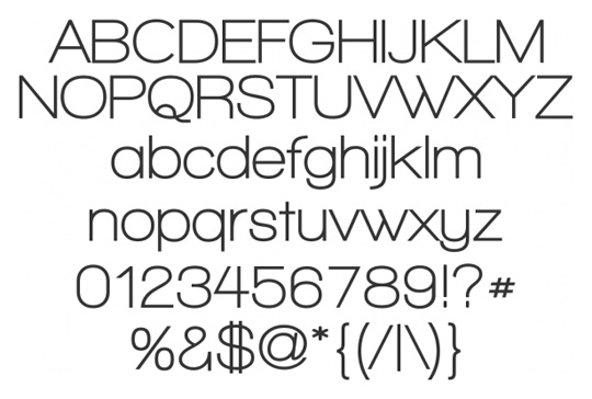
 One of the big mistakes that people make when looking for a font to represent their brand, is to pick one that is way to complicated and fancy. The reason this a bad idea is because it's hard to read. While this normally wouldn't be a big problem for when it's on a computer screen, it will become a problem when you put your logo on cars and other things. Now you might be thinking, "I can just change the font." You don't want to change your font, because that will change your brand image.
So what are you looking for when choosing a font. You want to choose something that's relatively plain and clean looking. You want others to be able to read it easily. Then when you move it to other types of platforms people don't have to squint to read it.
I hope this helped! Please share this with anybody you think this will benefit. Leave a comment(s) with any questions.
No comments:
Post a Comment